Illustrated promotional campaign for the PlayStation Store in EU & AU/NZ regions (60 locales in total). The promos celebrate (and put on sale) games set in and/or made in Japan.
The final design was localised into various languages, and used across both PlayStation and third party stores online and in print.

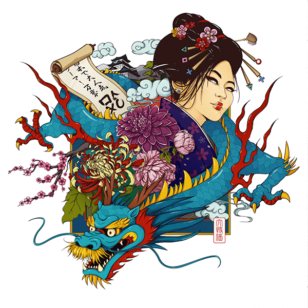
Final results
A note on the colours: The final colours used in the promo artwork are slightly different from the “ideal” colours I had planned, due to various factors. For example, the geisha’s face isn’t as white as originally planned and as it would be culturally accurate – these were design decisions to ensure the game artwork that would be next to it, would look as good as possible.
The showcased artwork below on the left is as the design looked when in use; however the featured “key art” asset on the right is how I’d have preferred it originally, with a more faded look.


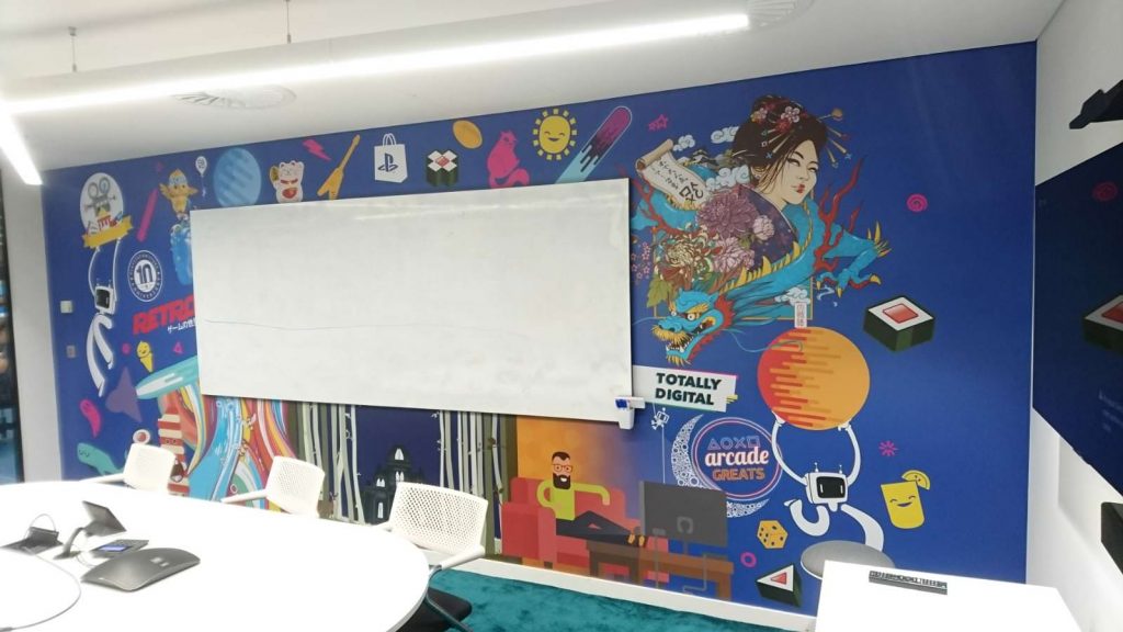
The artwork was quite popular among the team, and it made it onto a Head Office meeting room wall design!
The design process
The moodboard and then rough sketches were presented to marketing and merchandising stakeholders for approval.

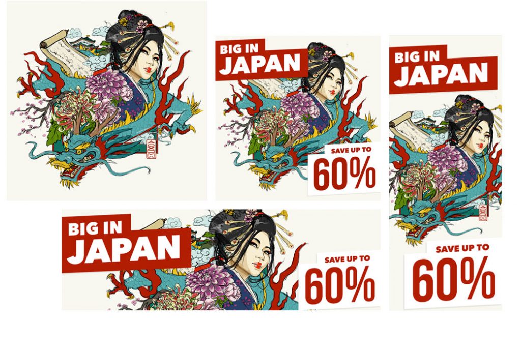
The style is based on a combination of traditional Japanese elements and prints, with a more modern, cel-shaded illustration style.
Want to work with me?
Pop me a message and I’ll respond ASAP. If you don’t hear back within a day or two, please check your junk mail folder!
Alternatively, if easier, you can email me with your project brief at hello@designsbybarb.co.uk!