Visual brand identity for a coaching business that specialises in maternal mental health and anxiety relief. The client requested a classy yet friendly look and feel with delicate, feminine colours, muted and soft visuals to represent a bright, positive, inviting and safe virtual space for mums in need of support and comfort.
Please note, websites are subject to updates and code changes; the link provided here may no longer be representative of my work and the original approved designs.

Final results
I wasn’t hired to redesign the actual website, but I did create a mock-up using the new brand visuals, to showcase how a revamped homepage could look using the existing content. The goal was to create a stronger emotional impact “above the fold” compared to the old site, which you can see below:


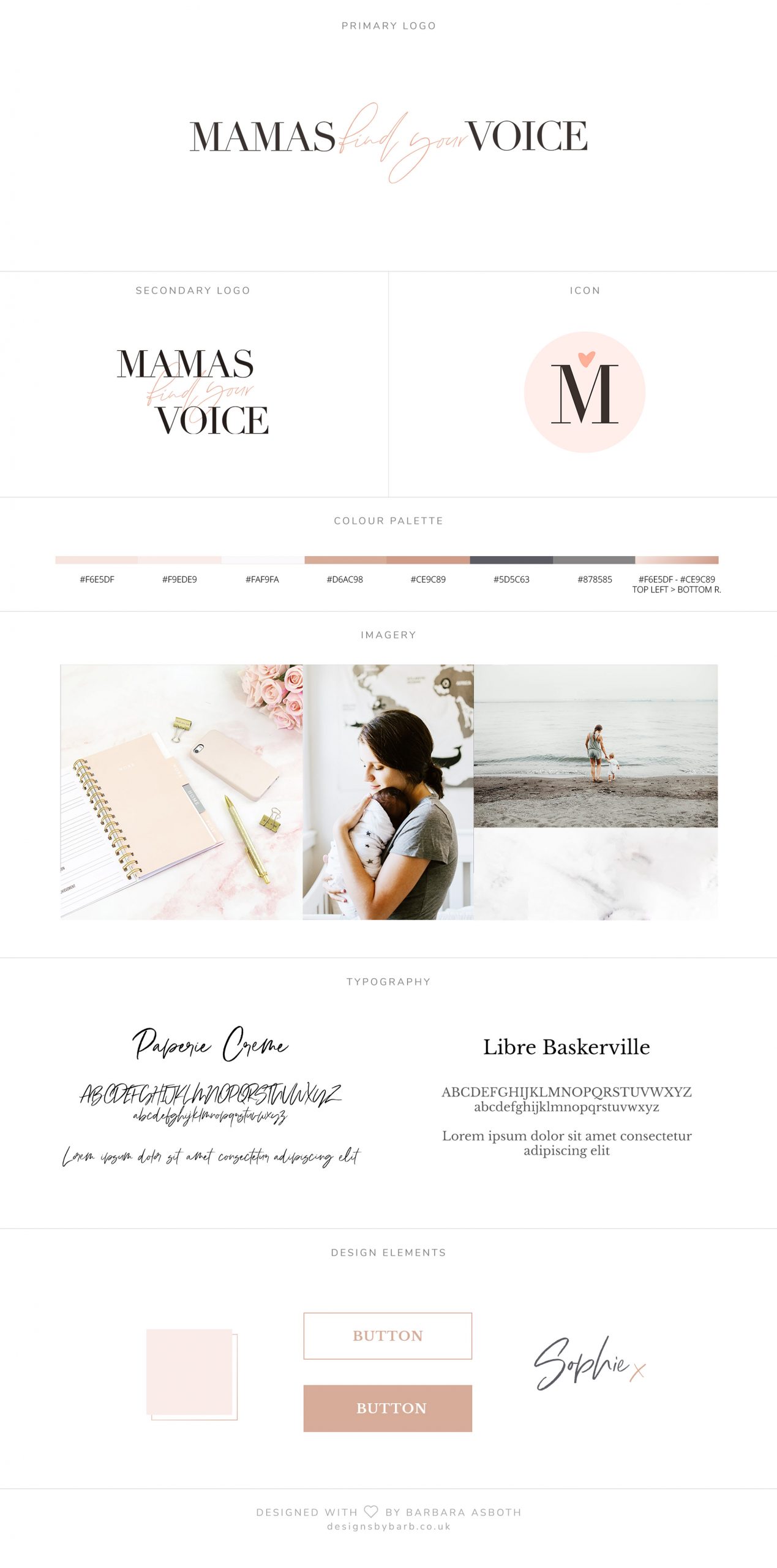
The final approved brand reference sheet, summarising the look and feel of the company. The client requested options for freely available stock photography examples, so I collected these from Unsplash and we also decided on purchasing a script font for headlines while keeping a free font for body copy, to balance personality with affordability.

Following these approved designs, I also redesigned the client’s email template, and provided guidance on social media look and feel best practices for Canva (the client’s choice of image editor). I also created three custom Lightroom Mobile presets to use on the go for social posts using the client’s own photographs, to tie in with the brand identity.
Design process
I created a moodboard based on the client’s answers to exploratory questions, and did an initial proposal presentation where I explained my recommendations and some design variants I thought would work. After discussion we settled on a script/handwritten font to add a personal touch, just for larger headings and highlighted text, and on a friendly, rounded serif font for body copy.


After a few rounds of logo mockups, the below wide and tall options were agreed on, combining a more formal, elegant font with whimsical handwriting to reflect the professional yet friendly approach of the company. A cute icon was also designed for socials and smaller areas where a full logo is not practical to use.


Want to work with me?
Pop me a message and I’ll respond ASAP. If you don’t hear back within a day or two, please check your junk mail folder!
Alternatively, if easier, you can email me with your project brief at hello@designsbybarb.co.uk!