Visual brand refresh and logo design for a local florist specialising in using seasonal, sustainably grown British flowers. The owner didn’t want a big change, just incremental updates to better reflect the handmade, whimsical, natural mood of her creations. She also needed a circular logo lockup that would become a custom stamp to brand the paper wrapping around the bouquets in any colour that matches the flowers, while keeping the wrapping fully recyclable.

Design process
I created a moodboard based on the project brief and the client’s answers to some more exploratory questions.
The client’s non-negotiable requests were:
🍃 Use mainly green hues in the brand, to reflect the name.
🍃 Keep the lowercase lettering for the logo and keep it rustic.
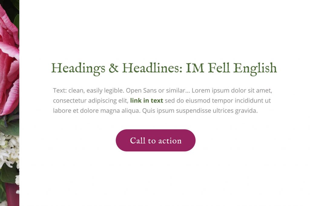
We settled on a roughened serif font for the logo and headlines, to add the required handcrafted touch to the branding. This was balanced with a modern, easy to read sans-serif font suitable for website body text.

Final results


I wasn’t hired to redesign the website itself, but I did create a simple homepage mock-up using the new brand visual direction, to showcase how a revamped homepage could look using the existing content. The goal compared to the old site was to create a stronger visual impact “above the fold” and add a clear Call to Action (in the form of a button to view products), which you can see below:
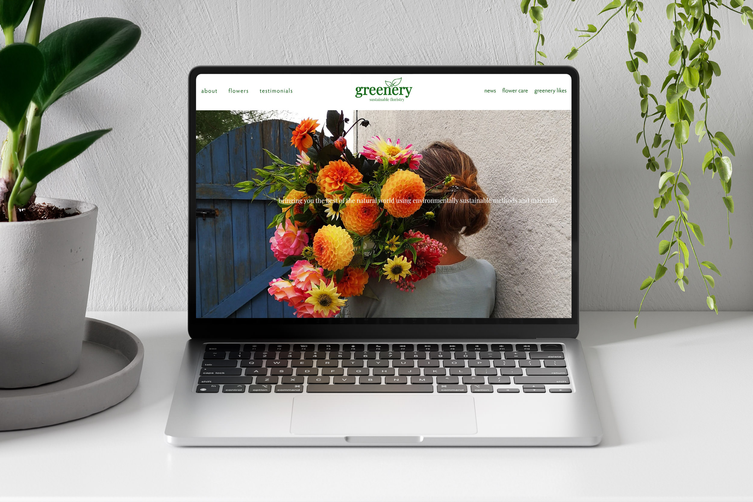
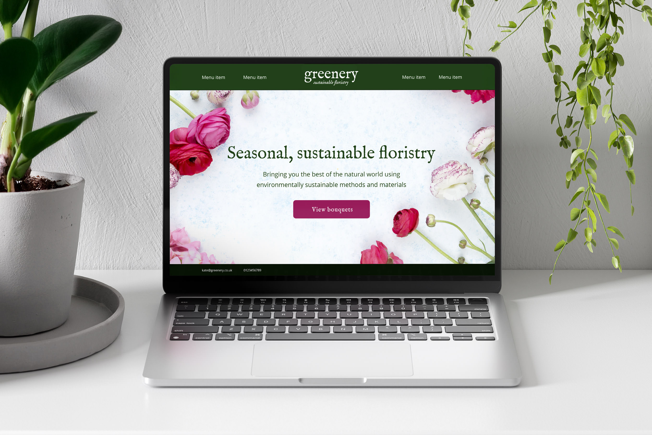
The idea was that the background image can be updated seasonally, to reflect what’s on offer that season – in the spring and summer it’s more often weddings, and in autumn/winter it’s seasonal wreaths.

Want to work with me?
Pop me a message and I’ll respond ASAP. If you don’t hear back within a day or two, please check your junk mail folder!
Alternatively, if easier, you can email me with your project brief at hello@designsbybarb.co.uk!